
 Full Screen
Understanding the Charts
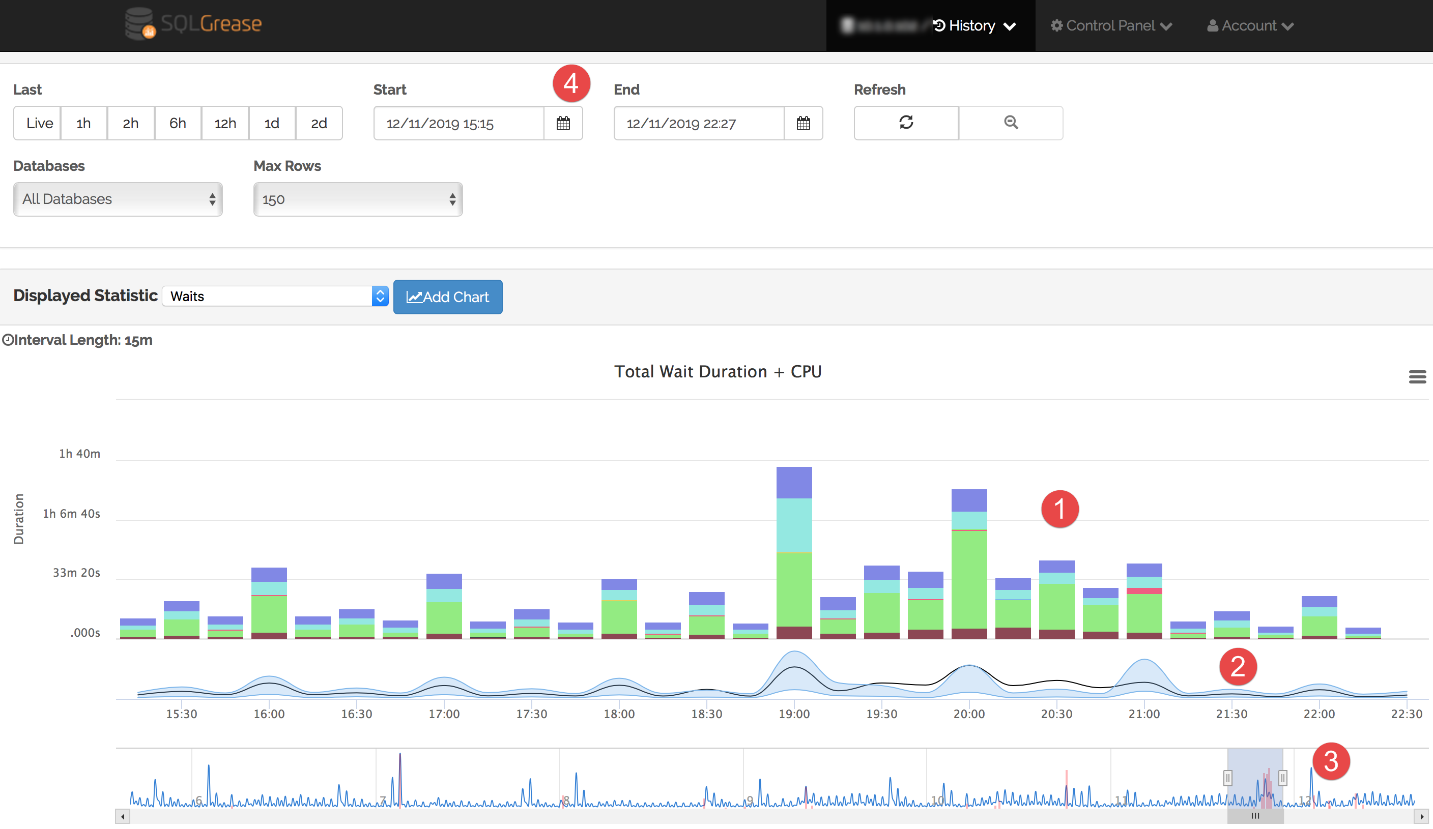
SQLGrease displays most of its information via time series charts. Time series charts display a date/time along the X axis and a monitored statistic(s) along the Y axis. This is an important feature when it comes to displaying performance anomalies.
1 The Primary Statistic Chart The primary statistic chart is selected in the "Displayed Statistic" drop down. In this screen shot, the "Waits" chart is selected. This chart is showing total query related wait time in combination with CPU time.
2 Anomaly Chart The anomaly chart will start to display once enough history is collected that SQLGrease can start detecting performance anomalies. In most cases this will appear approximately three days after performance monitoring begins.
3 Navigator Chart The navigator chart displays data approximately 30 minutes after performance monitoring begins. The navigator chart shows a broader timeframe than that selected in the date selector. By default this displays the last week of monitoring data.
4 Date Selector The date selector is used to control the timeframe displayed in the primary statistic chart and the detected anomaly chart.
 Full Screen
Date Selection
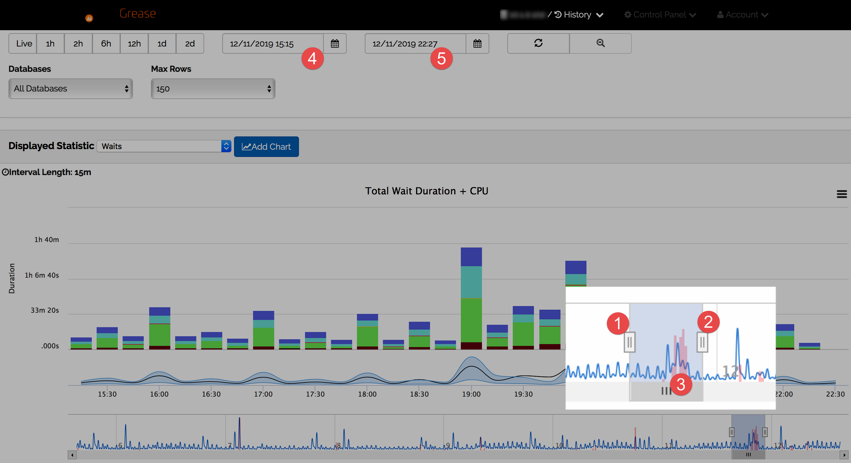
Date selection is a key feature to using SQLGrease even when anomaly detection is not involved.
1 Start Navigator Handle The start navigator handle coincides with the date/time displayed in the date selector 4.
2 End Navigator Handle The end navigator handle coincides with the date/time displayed in the date selector 5.
3 Detected Anomaly The shaded red area indicates an anomaly was detected. The height of the shaded area indicates the extent of the detected anomaly.
 Full Screen
Anomaly Chart
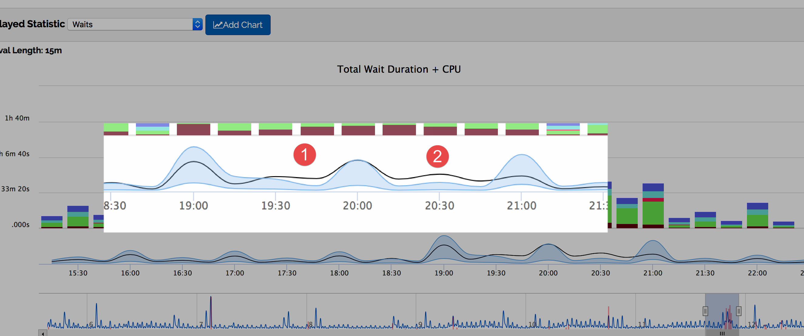
The anomaly chart displays the upper and lower bounds of expected values and the actual values. The series shaded in light blue marks the upper and lower bounds. The black line displays the actual value. Anomalies can either by "Positive" or "Negative". A positive anomaly indicates the actual value was higher than the upper bound of the expected value. A negative anomaly indicates the actual value was less than the lower bound of the expected value.
1 Positive AnomalyAt 19:45 (between 19:30 and 20:00) a positive anomaly was detected.
2 Positive AnomalyAt 20:30 a second positive anomaly was detected.
 Full Screen
Using The Primary Statistic Chart (Waits) To Spot The Anomaly Cause
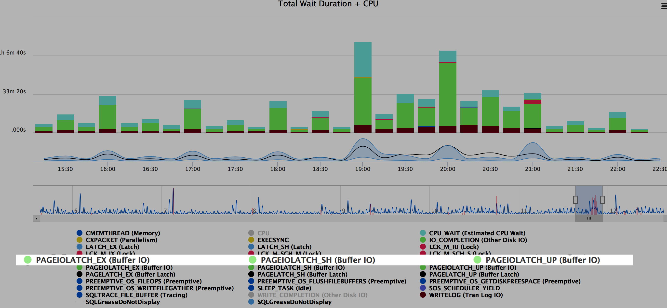
From looking at the primary statistic chart, it appears there is an increase in PAGEIOLATCH waits in the timeframes where the anomalous activity occurs.
1 PAGEIOLATCH_*By inspecting the chart legend, the green color represents PAGEIOLATCH_UP, PAGEIOLATCH_SH, and PAGEIOLATCH_EX. These are all waits associated with slower physical reads occuring on data files.
 Full Screen
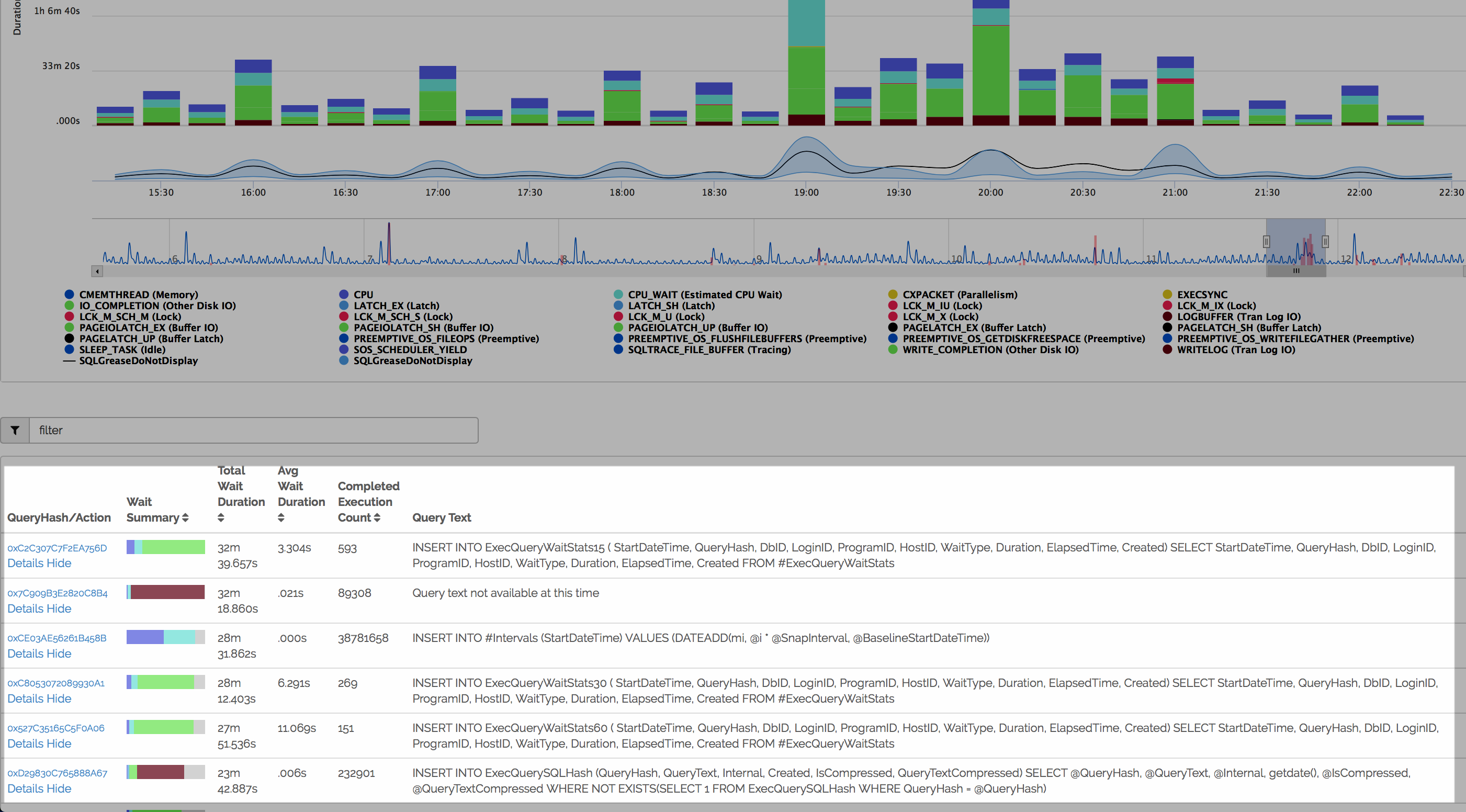
Identifying The Queries Contributing
By scrolling down further, a list of all queries contributing to the PAGEIOLATCH waits are displayed. The queries with the highest amount of green are the most impacted by PAGEIOLATCH waits. From here the query details link can be clicked. This will go to the query detail view. The query detail view contains detailed statistics that would help in identifying if the issue is query related (i.e. execution plan regression or higher than normal physical reads).
 Full Screen
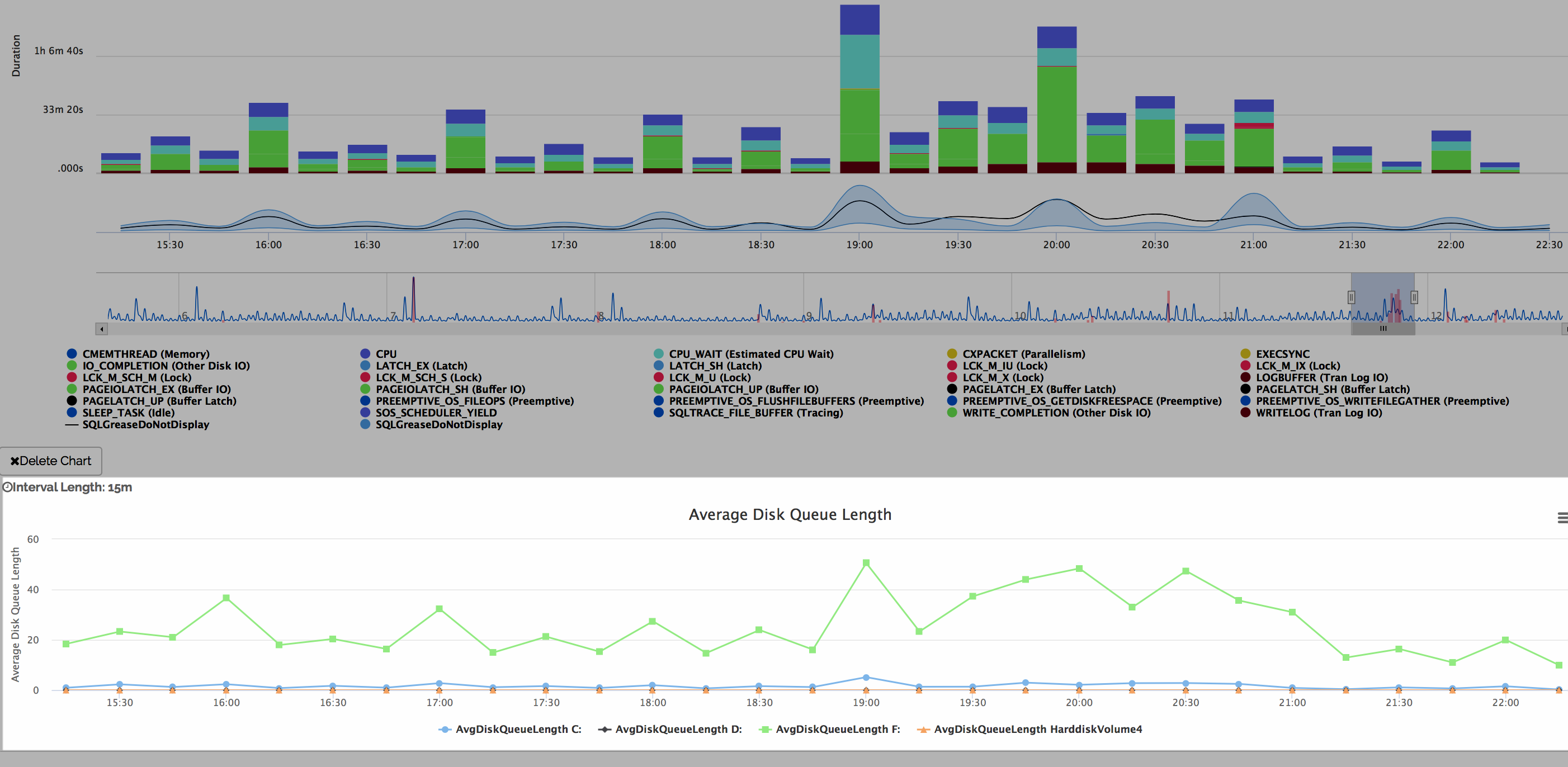
Adding Perfmon Data To Dig Further
In this scenario, it was determined the top queries being impacted by PAGEIOLATCH waits did not show plan regressions or higher physical IOs per execution. To determine if there is a possible issue with the IO subsystem, additional charts can be added. SQLGrease collects perfmon data - this data can be added in additional charts. In this screenshot an Average Disk Queue Length chart was added. From this chart it is possible to see there were higher than normal disk queue lengths during the period SQLGrease detected anomalies.